


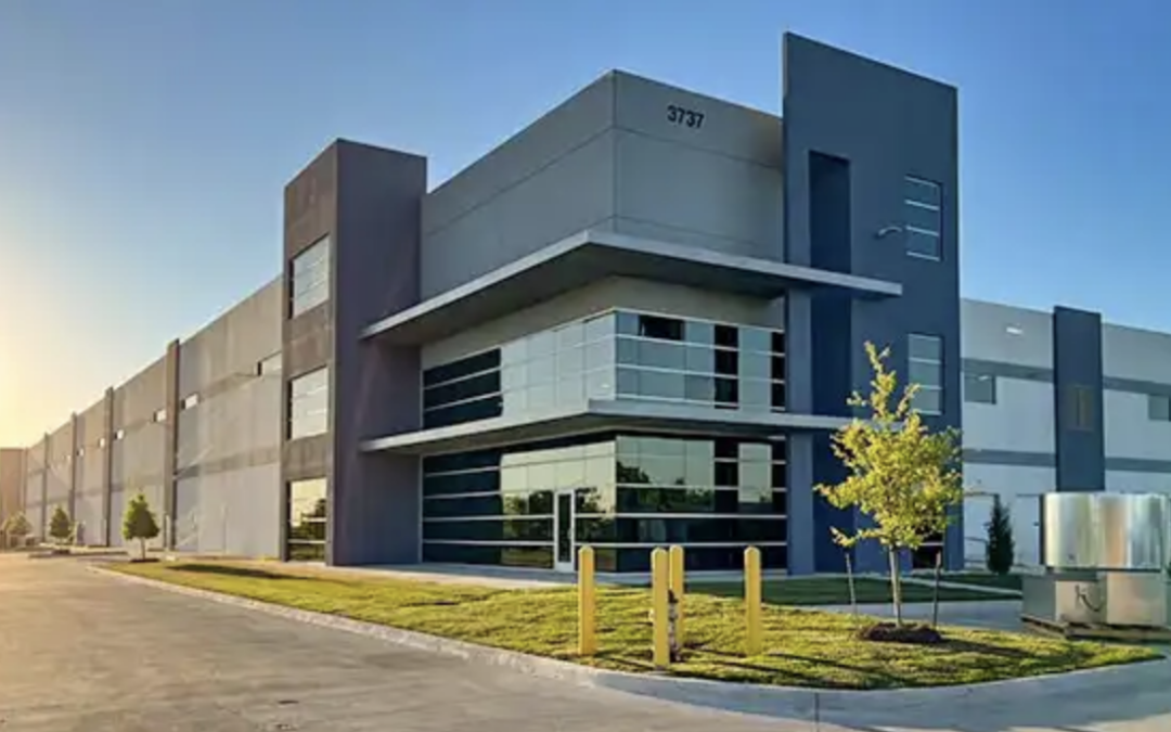
Greif Announces Opening Of New Manufacturing Plant In Dallas, TX
Delaware, Ohio based Greif announced the finalization of construction on their new bulk corrugated manufacturing facility in Dallas, Texas. Scheduled to open later this spring, Greif says the new facility will significantly expand its capacity in the bulk corrugated...
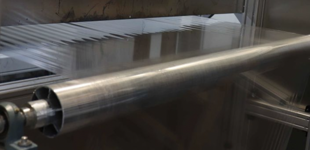
Flexo Wash Develops Solution For Film Reuse
Plastic film is widely used in various industrial applications and has become a significant environmental concern due to its contribution to plastic pollution. Flexo Wash understand the printing industry’s struggle to have dirty printed film and having to dispose of...

FBA Welcomes Jim Thomson To Annual Meeting Stage
The Fibre Box Association (FBA) announced Walmart’s Jim Thomson as a speaker at the upcoming FBA Annual Meeting set for May 6-8 at the Ocean Reef Club in Key Largo, Florida. As the Director of Packaging Product Development, Thomson will share Walmart’s approach to...
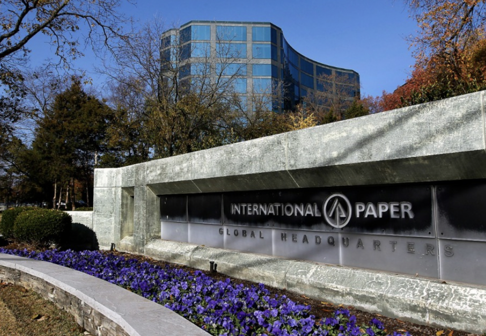
IP To Acquire DS Smith For $9.9B
Memphis, Tennessee based International Paper (IP) and London, England based DS Smith announced...
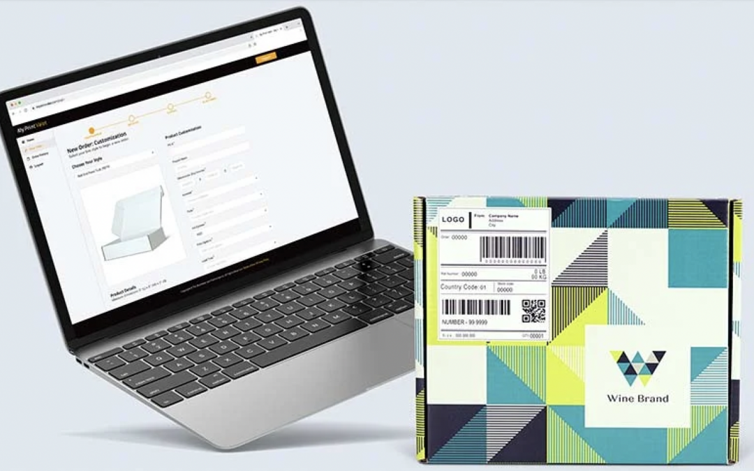
The BoxMaker Celebrates 100,000th Web-to-Print Packaging Order
Seattle, Washington based The BoxMaker, a United States manufacturer of digitally printed...
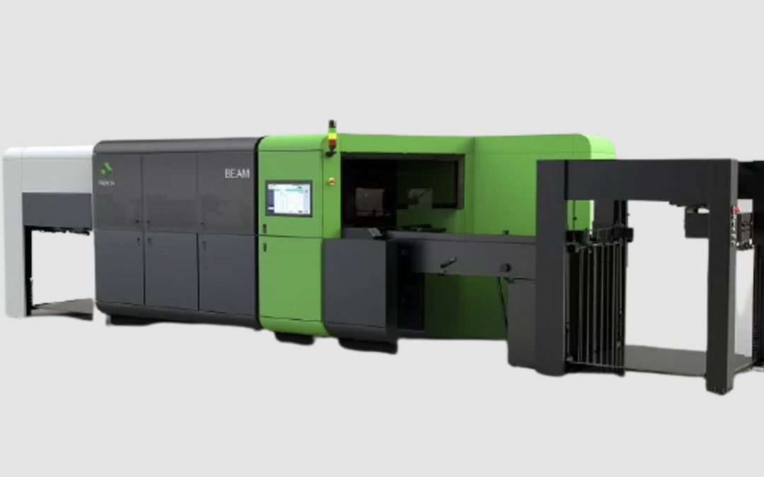
Menasha Packaging Invests In Highcon Die Cutting System
Neenah, Wisconsin based Menasha Packaging announced an investment in a Highcon Beam 2C digital die...
Acme Corrugated Invests In Second Isowa Falcon
Hatboro, Pennsylvania based Acme Corrugated Box Company, Inc., which recently celebrated 105 years...